Art Direction for a Cohesive Whitepaper Design
Establishing visual consistency and hierarchy across complex information
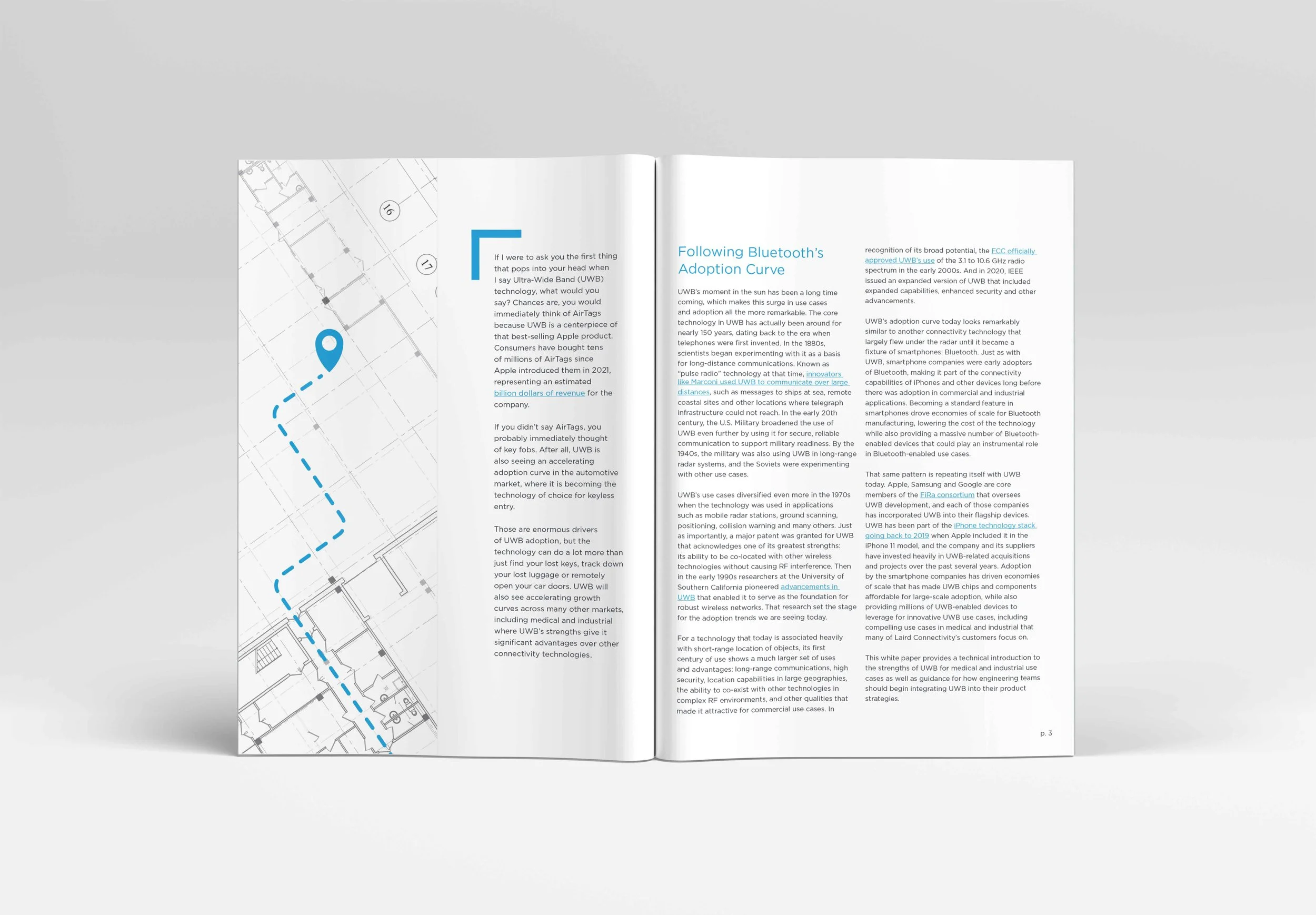
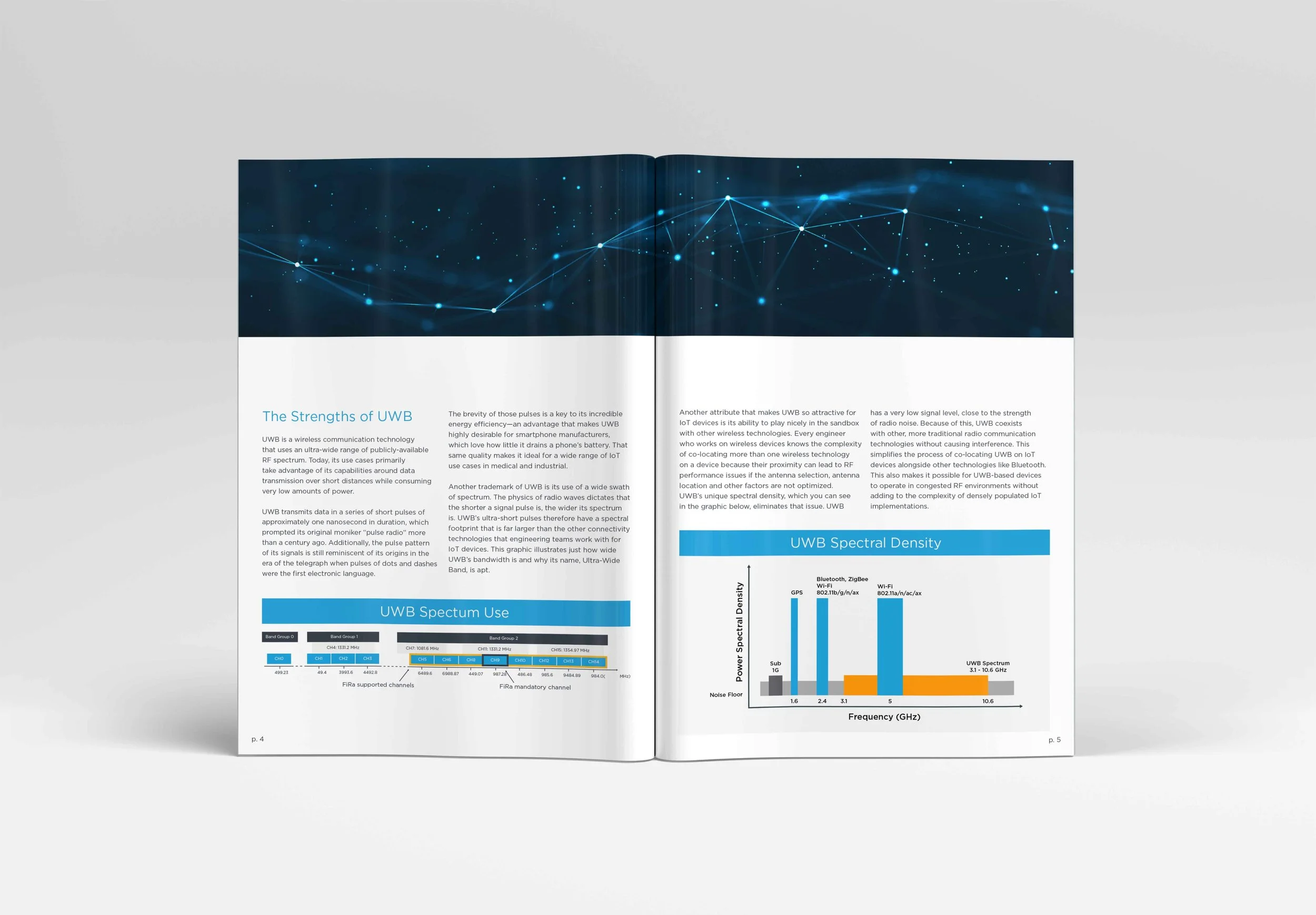
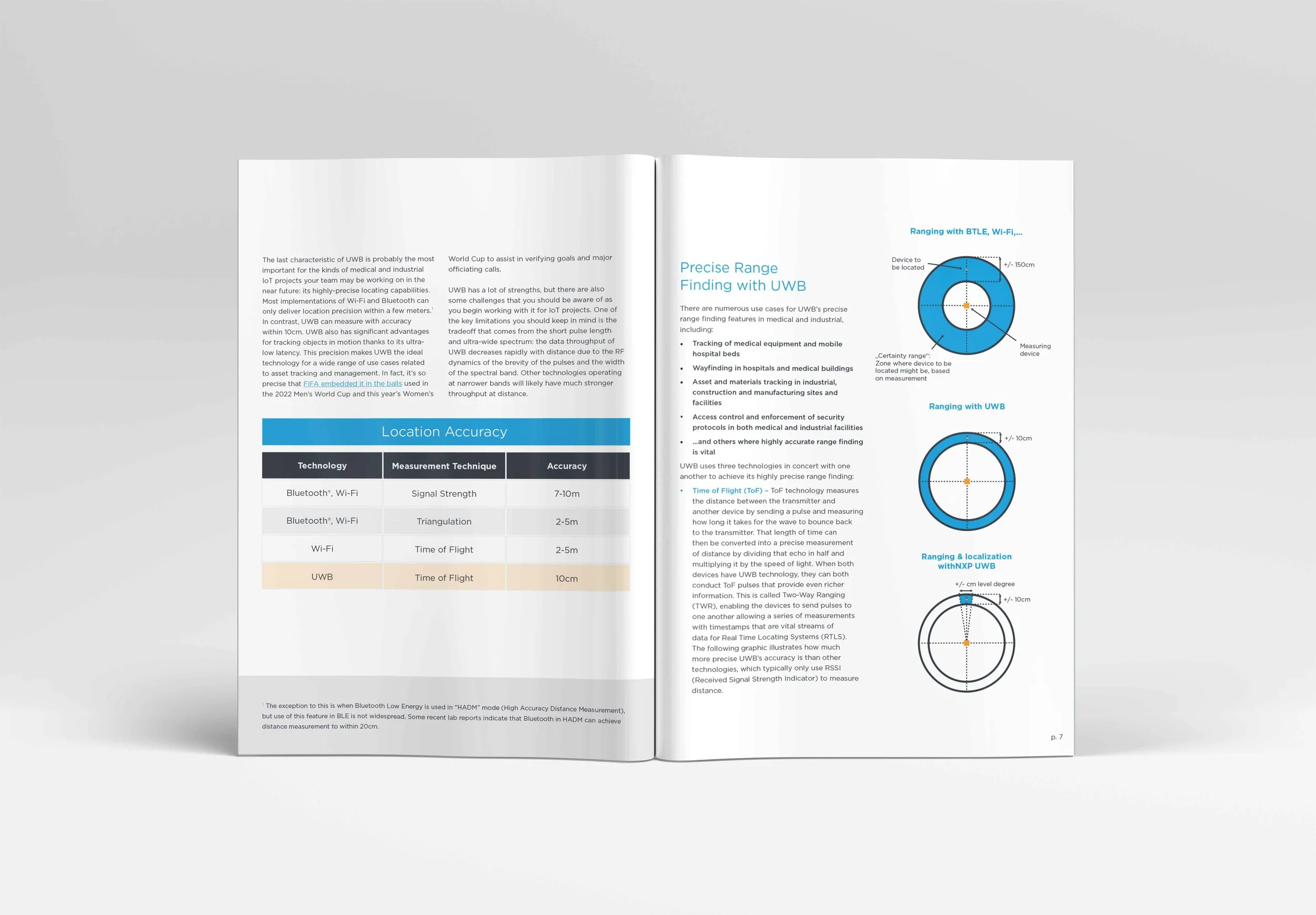
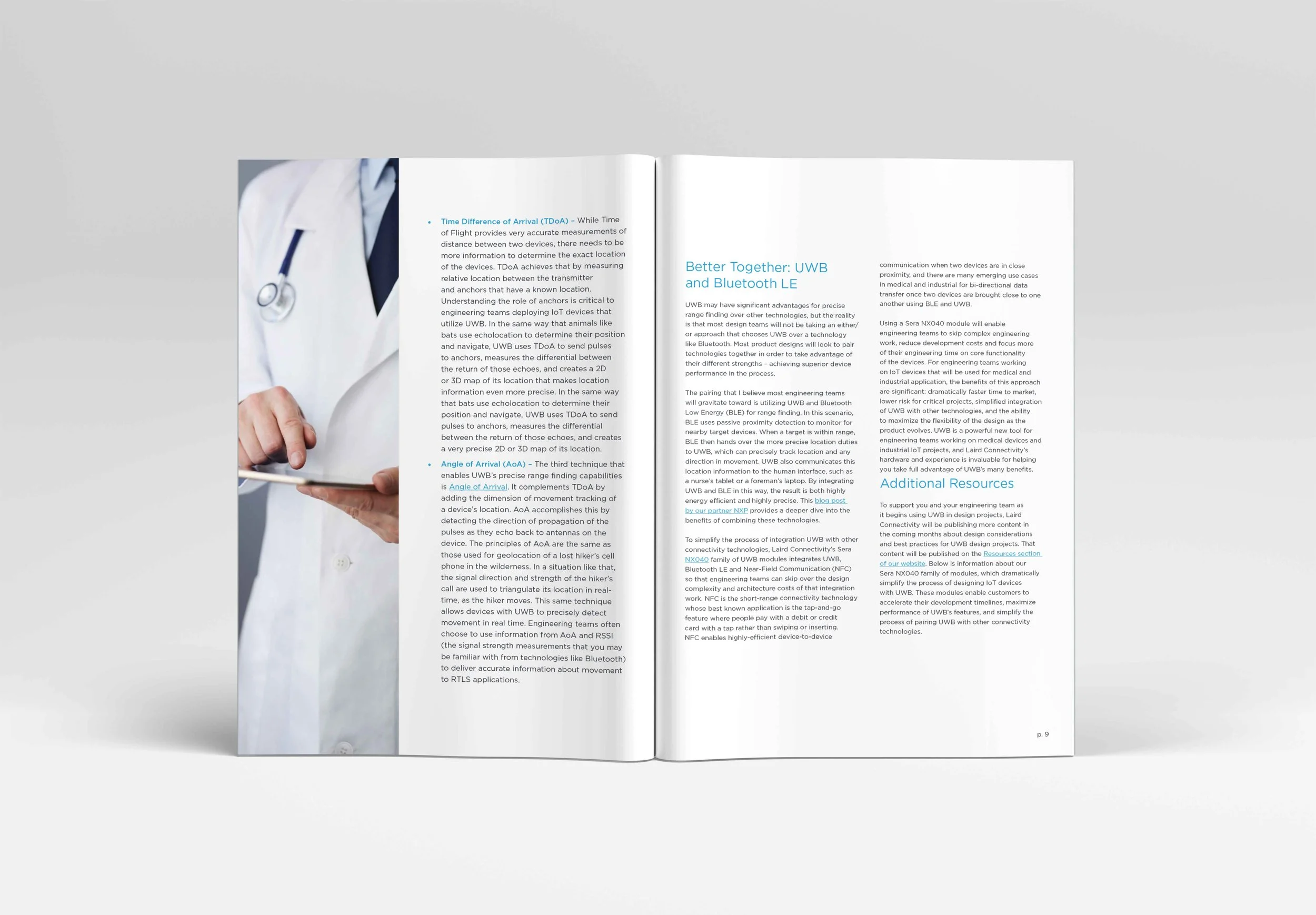
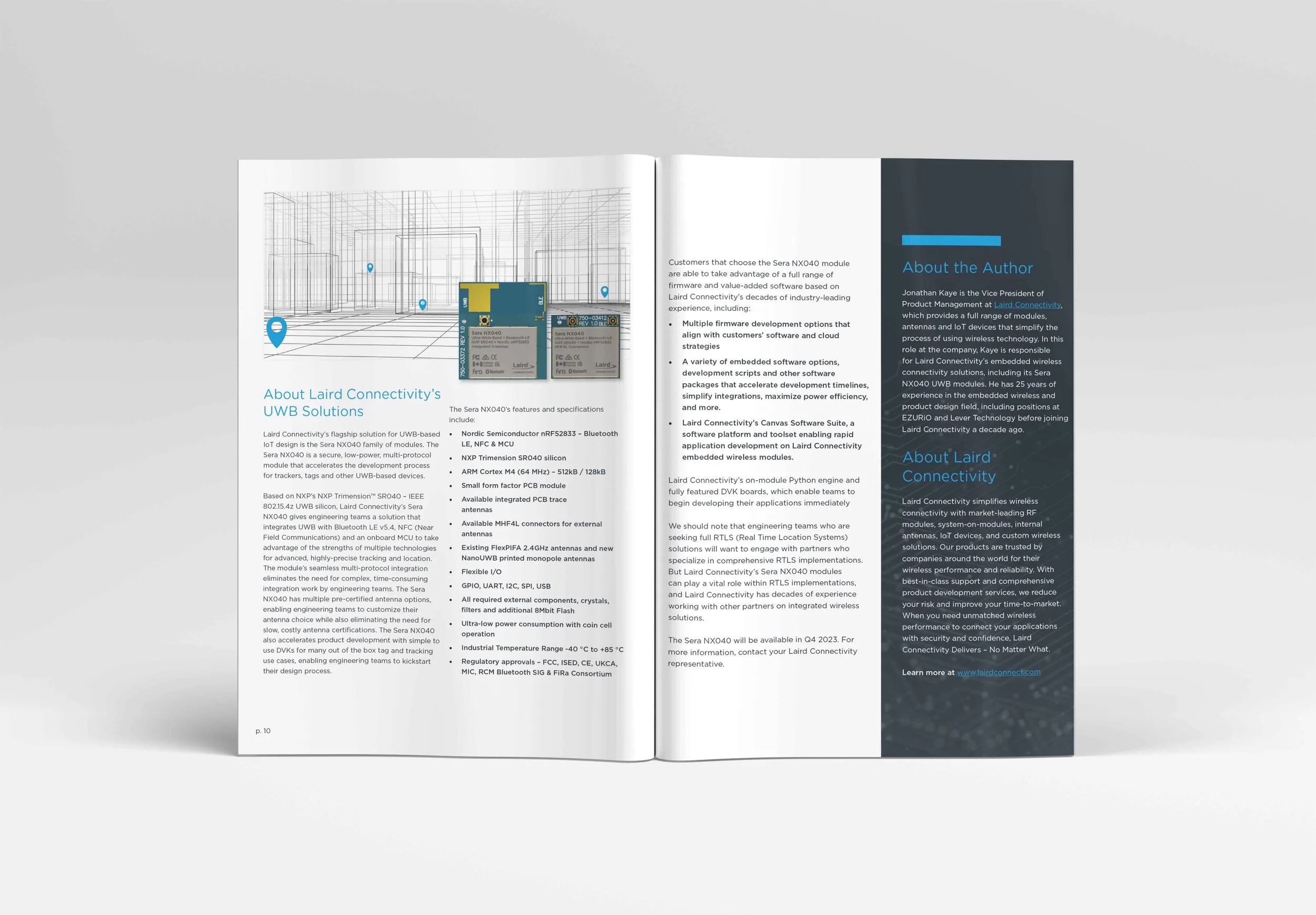
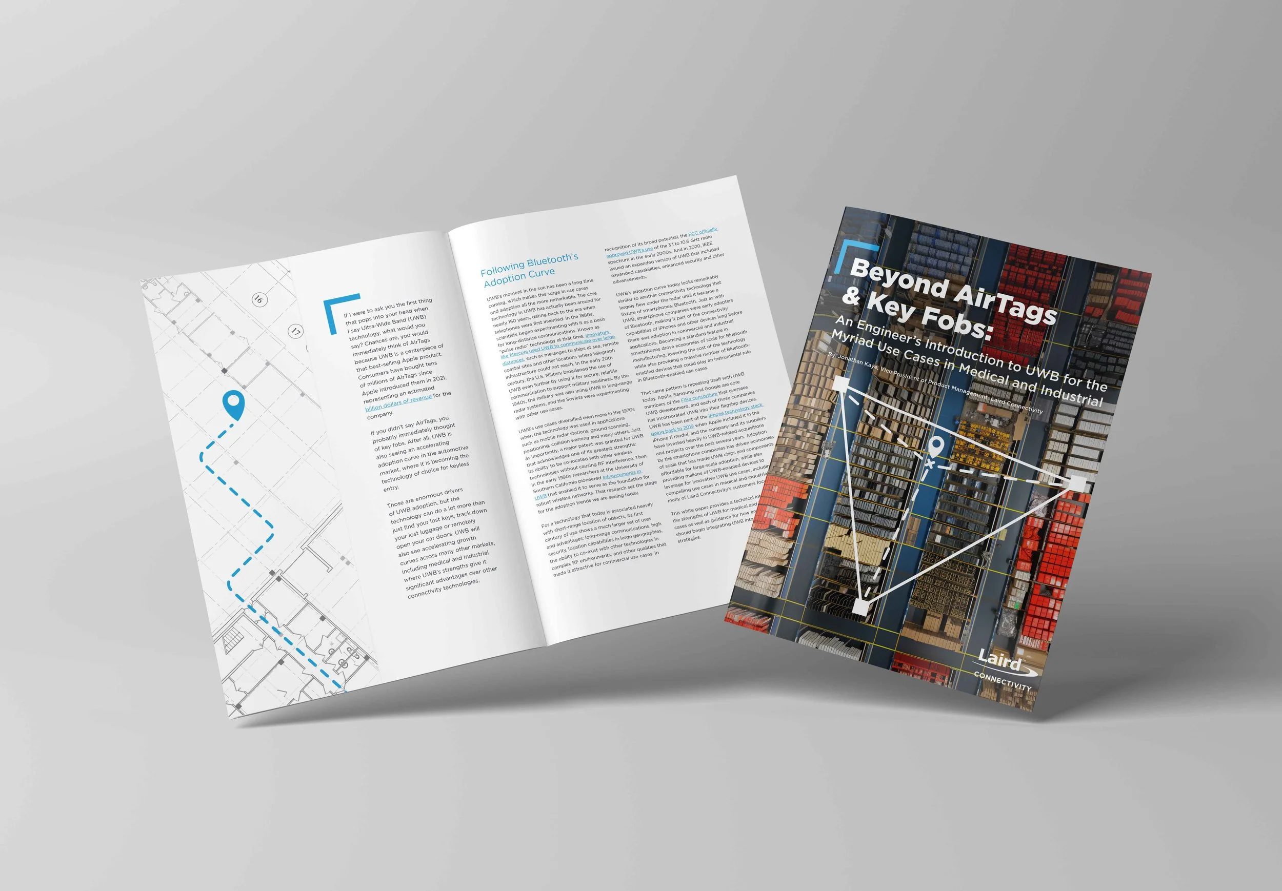
For this whitepaper project, I led the art direction to create a clean, modern visual system that aligned with the client’s brand identity and elevated the reading experience. I developed typography hierarchy, and grid structure that guided both design and content flow. Each visual element—from infographics to imagery—was intentionally chosen to support clarity and maintain a consistent tone across all pages. The result was a publication that balanced technical accuracy with visual appeal, reinforcing the brand’s professionalism and credibility.